Dark Theme for Flutter Applications
This tutorial will explore how to implement Dark Theme in the Flutter applications and update the State of the UI with Provider State Management Tool


Introduction
One of my favorite features in modern-day applications is the dark theme, and I am sure most of you can relate to the pain of looking at a bright light screen in the middle of the night. Dark theme is good for the eyes, it looks pretty cool, it opens unlimited possibilities for Star Wars references, and it is unbelievably easy to implement. So, let's discover the secrets of the dark theme...
In this tutorial, we are going to go ahead and start by creating a new blank project. In case you would like to know how to create a new Flutter project, check out the official documentation.
Building the UI
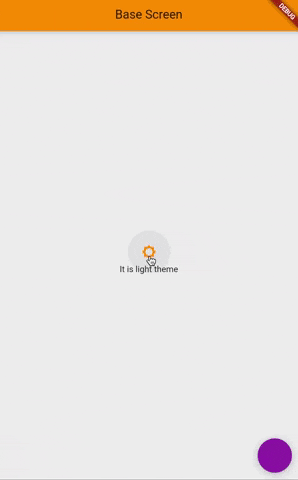
After creating the new project, let's implement a basic UI layout to understand how dark & light theme works. Now create a file named dark_theme_page.dart inside the lib folder.
flutter-app/
|- android
|- build
|- ios
|- lib/
    |- dark_theme_page.dart
    |- main.dart
|- test
Next, add a StatefulWidget named DarkThemePage inside the file.
 class DarkThemePage extends StatefulWidget {
  @override
  _DarkThemePageState createState() => _DarkThemePageState();
}

class _DarkThemePageState extends State<DarkThemePage> {
  @override
  Widget build(BuildContext context) {
    return Scaffold(
      appBar: AppBar(
        title: Text('Base Screen'),
      ),
      floatingActionButton: FloatingActionButton(onPressed: (){}),
      body: Column(
        mainAxisAlignment: MainAxisAlignment.center,
        children: [
          IconButton(
            onPressed: () {},
            icon: Icon(
              Icons.brightness_5,
            ),
          ),
          Center(
            child: Text(
              'Text color will change with the theme',
            ),
          )
        ],
      ),
    );
  }
}
Now go ahead and replace the MyHomePage widget with DarkThemePage inside MaterialApp in main.dart.
The screen is set. In the next step, we will implement functionalities one by one.
ThemeData class
From the official documentation; Defines the configuration of the overall visual Theme for a MaterialApp or a widget subtree within the app.
Flutter handles the overall theme of the app under theme property in MaterialApp widget. Theme property takes one argument that is a ThemeData class. This class has all the properties that can be customized to create an overall theme for the applications from text styles to variety of colors.
So in general, we are going to create a logic that when pressing a button, we are going to run a boolean function that says if the theme is dark then use themeData for dark theme, if not use themeData for light theme. This also means that you can create and implement multiple themes on your own once you create, define and customize a theme under ThemeData class.
For this reason, let's create themeData classes to create light & dark themes.
Inside the lib folder, create a new file called theme_data.dart.
flutter-app/
|- android
|- build
|- ios
|- lib/
    |- theme_data.dart
    |- dark_theme_page.dart
    |- main.dart
|- test
In here let's create two ThemeData classes. One for light and one for dark theme.
final ThemeData themeDataLight = new ThemeData(
    brightness: Brightness.light,
    primarySwatch: Colors.orange,
    primaryColor: Colors.orange[500],
    primaryColorBrightness: Brightness.light,
    scaffoldBackgroundColor: Colors.grey[200],
    accentColor: Colors.purple[500],
    accentColorBrightness: Brightness.light);

final ThemeData themeDataDark = ThemeData(
  brightness: Brightness.dark,
  primaryColor: Colors.red,
  primaryColorBrightness: Brightness.dark,
  scaffoldBackgroundColor: Colors.grey[850],
  accentColor: Colors.blue[500],
  accentColorBrightness: Brightness.dark,
);
ThemeData class comes with tons of properties that can be customized to create a unique theme for the applications. In this example, we are going to cover the most important ones.
- brightness: Defines the default textStyle color for the text.
- primaryColor: The main color that is going to be used inside the app
- primarySwatch: This property acts as the primaryColor, and further it uses different shades of the given color in different areas
- primaryColorBrightness: Used to determine the color of text and icons placed on top of the primary color.
- scaffoldBackgroundColor: background color for all the scaffolds
- accentColor: secondary color used within the app e.g. FloatingActionButton
- accentColorBrightness: Used to determine the color of text and icons placed on top of the accent color.
Basically, the primary color is used in AppBar and the accent color (which is the second color) is used in FloatingActionButton. This concept is designed by google as a design guideline called Google Material Design and embedded inside Flutter material design by default, which means, even by changing only those two colors you can still create a nice looking theme.
The beauty of this widget is that it can be customized in a variety of ways from textStyle to check boxes. This means that defining every UI-related property in the ThemeData will keep the UI consistent and effortless throughout the project.
The colors that I have chosen are to visualize the differences between the themes easily, and it is up to you to choose whichever color in your own implementation.
Besides, we can even further change the colors of anything with the theme colors. Let's change the color of the icon with the primary color.
icon: Icon(
              Icons.brightness_5,
              color: Theme.of(context).primaryColor,
            ),
Note: A hot restart is required each time ThemeData class is modified. Because the MaterialApp widget is on the top of the widget tree, and It can only be re-rendered by completely restarting the application...
Adding State with Provider
Someone who works with Flutter for a while must have heard about state management a couple of times a day at least. Within the tutorial, the Provider will be used for its simplicity and wider popularity. Still, you can use any state management solution that you are comfortable with.
The idea is to create a boolean variable isDarkTheme and when set to true, the theme will change accordingly. The state management tool will be used to notify the change across the widget tree and update the state of the UI.
Let's go ahead and create a new file called theme_provider.dart inside the lib folder. In here, we are going to create a class named ThemeProvider that extends to a ChangeNotifier class. In case you are new to Provider, I highly recommend going through the official documentation in Google's Flutter library to understand the terms and basics.
Inside the ThemeProvider class there will be one boolean property named isDarkTheme and one method named changeTheme that toggles the boolean value when it is fired.
class ThemeProvider extends ChangeNotifier {
  bool isDarkTheme = false;

  void changeTheme() {
    isDarkTheme = !isDarkTheme;
    notifyListeners();
  }
}
Next step is to go to dark_theme_page.dart file and wrap the widget with a Consumer where we want to use the ThemeProvider class. In our case it will be the Column widget because we want to change the theme by firing the changeTheme method when we press the IconButton.
 Consumer<ThemeProvider>(
        builder: (context, themeProvider, child) => Column(
        mainAxisAlignment: MainAxisAlignment.center,
        children: [
          IconButton(
            onPressed: () {},
            icon: Icon(
              Icons.brightness_5,
            ),
          ),
          Center(
            child: Text(
              'Text color will change with the theme',
            ),
          )
        ],
      ),
      ),
Now let's add changeTheme method inside the onPressed function by calling it from themeProvider class.
onPressed: () {
                themeProvider.changeTheme();
              },
As for the final step, first we need to present the ThemeProvider class from top of the Widget tree to so that it can be accessed in lower parts of the tree such as in the dark_theme_page.dart. This will be done via Provider's ChangeNotifierProvider widget.
Next, we need to tell the MaterialApp widget that the theme has changed. Once again, we will use a Consumer widget to wrap the MaterialApp widget to use the value of isDarkTheme variable. The final code will look like as is below.
ChangeNotifierProvider(
      create: (_) => ThemeProvider(),
      child: Consumer<ThemeProvider>(
        builder: (context, themeProvider, child) => MaterialApp(
          title: 'Flutter Demo',
          theme: themeProvider.isDarkTheme ? themeDataDark : themeDataLight,
          home: DarkThemePage(),
        ),
      ),
    );
#
As for the changes to kick in, let's restart the application. Now press the button to change the theme.
Bonus
You do not have to settle for only color changes with a different theme. Your widgets can also change. As an example, I would like to change the icon when the theme changes.
Let's go ahead and use a ternary operator inside the Icon widget to change the type of the icon.
 IconButton(
            onPressed: () {
              _themeStore.changeBrightnessToDark(!_themeStore.darkMode);
            },
            icon: Icon(
              _themeStore.darkMode ? Icons.brightness_5 : Icons.brightness_3,
              color: Theme.of(context).primaryColor,
            ),
And that's it! With this knowledge, you can create and customize unique and cool looking themes on your own. If you are looking for deeper customizations I highly recommend going through the properties of ThemeData class and experiment on your own.
You can find the source code within the github repository.